FINTECH
Pulsoo
A free financial management app for micro and small businesses, launched by BPI and NOS, bringing multi-bank aggregation via Open Banking, tax and social security alerts, and payment initiation into one app.

Overview
Dense financial data, made usable
Pulsoo is a free financial management app for micro and small businesses, launched by BPI and NOS. The hardest problem in the product was the Accounts screen: showing cash flow and period comparisons on a phone screen to business owners with no financial background. I tested more than 30 documented chart-type and color iterations before converging on a version that made dense financial data legible without oversimplifying it, then restructured the inherited design system behind it to support that decision at scale.

THE BUSINESS CONTEXT
An open-innovation bet for SMEs
In Portugal, micro and small businesses frequently manage cash flow across separate bank accounts while dealing with isolated portals for the Tax Authority and Social Security, with no single view of where their business actually stands. Incubated within BPI's Centre of Excellence for Innovation and New Business in partnership with NOS, Pulsoo was launched as an innovation experiment rather than a core banking utility. Free and bank-agnostic from day one, with no customer lock-in, it scaled to over 10,000 daily active users within sixteen months of launch.
IDEATION & VALIDATION
SME cash flow, readable without an accountant
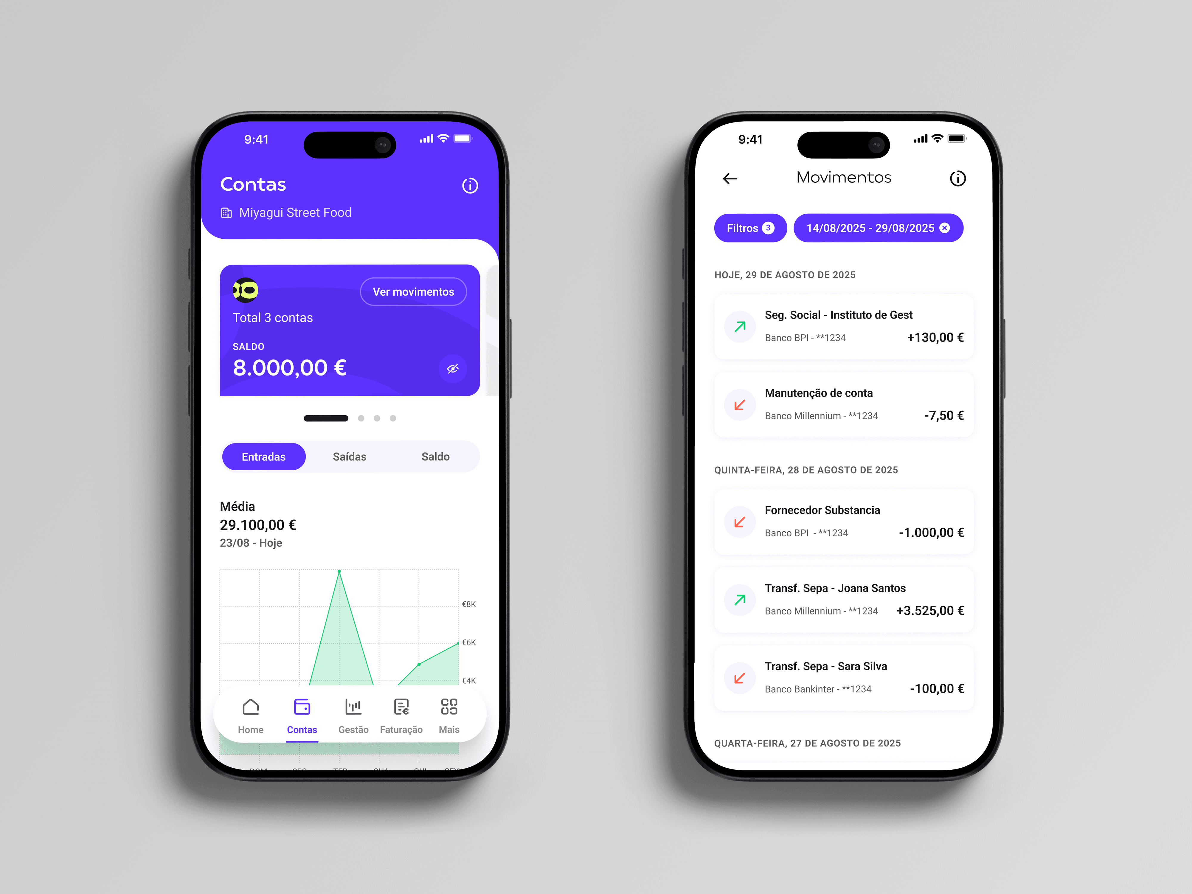
The Accounts screen is a treasury dashboard for business owners with no financial training. The challenge was structural: three variables (Inflows, Outflows and Balance), four timeframes (weekly, monthly, six-month and annual), and a comparison against the equivalent previous period, all on a single screen.
The hard part was finding the point where analytical depth stopped helping and started to overload. I worked through more than thirty iterations of chart type, data density and filter logic until a non-specialist could read their liquidity at a glance.
1. One balance instead of several banking apps
Open Banking data from every connected bank is aggregated into a single consolidated balance. The owner checks one place instead of reconciling accounts across several banks.
2. Cash flow at a glance
Switching between Inflows, Outflows and Balance turns a spreadsheet exercise into a direct answer to the owner's first question: is more money coming in than going out this period?
3. Trends without an interpreter
The timeframe scales from one week to a full year, with the equivalent previous period overlaid. The owner can spot seasonality, track growth and anticipate cash-flow dips without waiting for an accountant to interpret the numbers.
4. From trend to transaction
A chart only matters if it leads to a decision. Beneath the visualization, a filtering layer applies progressive disclosure: the owner starts from the overall trend and narrows it down to a single account or a single transaction.
KEY DECISIONS
Regulatory complexity, out of the business owner's way
1. One adaptive flow for five fiscal documents
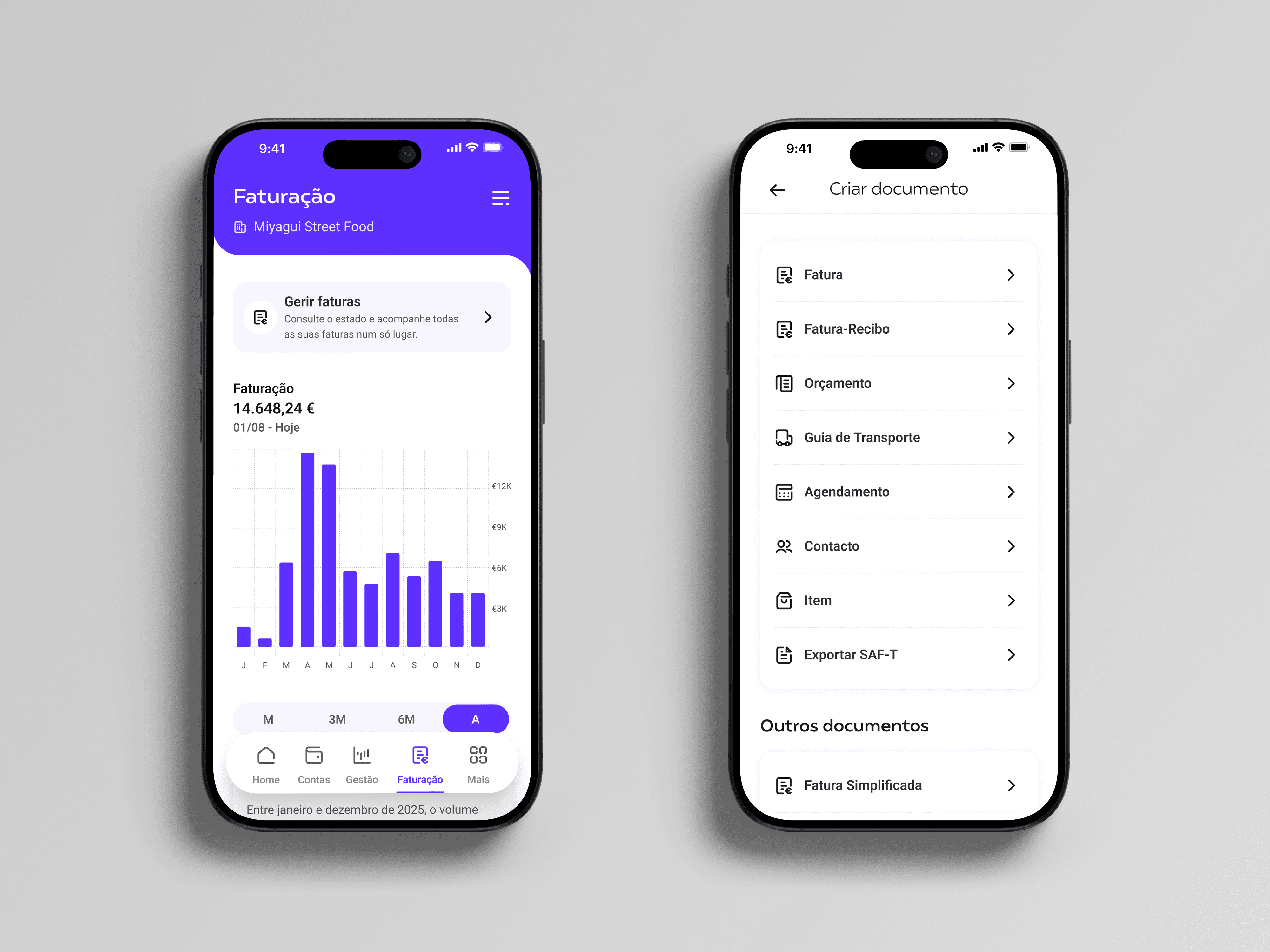
Pulsoo integrates InvoiceXpress, an AT-certified invoicing engine, natively inside the app. It issues five document types (invoices, invoice-receipts, quotes, transport guides and recurring invoices), each with its own fiscal rules: withholding tax, VAT exemption reasons, series and currency. Instead of designing one screen per document, I designed a single flow (client, dates, fiscal details, items, preview) that shows only the fields each document requires. Recurring rules close with a plain-language summary: "The invoices from this schedule will be finalized and sent every 10 days." The cost was more complex conditional logic to build and test, and fields that shift between document types. I contained it with a fixed step order and a full preview before "Finalize". The result is one flow to maintain instead of five.
2. Two public entities, two mental models
The Tax Authority and Social Security both hold money a business either owes or is owed, but I organized them differently on purpose. Tax obligations are ordered by urgency ("Overdue", "Due soon", "Processed"), because that is how a business owner triages tax deadlines. Social Security is organized by the direction of the money (receivable, payable and refunds), because contributions work more like a ledger than a deadline list. Two sibling screens with different logic break visual consistency, so I contained that cost where it matters most: both end on the same detail screen, with the amount, a copyable reference, the due date and a "Pay" button, plus an explicit "Payment unavailable" state when payment is not yet possible.
3. A system built to scale, not just a file split in three
Pulsoo's initial UI kit was built to launch, not to scale: foundations and components lived in a single file with no room to grow. Over six months, without pausing live development, I restructured it into three Figma libraries (Foundations, Assets and Components) and designed what the kit never had: IBAN and amount inputs, PSD2 consent states and cash-flow projection charts. I also built accessibility into the system rather than screen by screen: I ran every flow through WCAG contrast checks and rebalanced the type scale, so each new screen inherited both.
The cost was resolving legacy inconsistencies component by component, with no second reviewer to challenge the new structure before it shipped. I contained it by fixing naming conventions and state matrices upfront, so every new component had to meet the same rules before merging.
The result is 56 components, 173 icons and 29 pictograms, all implemented in production. Card Balance, built to show balances, now also serves aggregation, consent renewal and onboarding.
WHAT WAS DELIVERED
One screen I rebuilt, one feature I designed from scratch
Home: from an activation screen to a daily dashboard
When I joined, Home was an activation screen: two setup actions, a list of articles and a four-tab navigation. I rebuilt it as the business's daily starting point and restructured the navigation into five tabs (Home, Accounts, Management, Invoicing and More), giving planning and invoicing a permanent place in the product. Home now opens on a carousel of analyses (monthly cash flow, quarterly trend, and forecast versus actual inflows and outflows), followed by a seven-day financial agenda, the compliance status of both public entities and a plain-language insight: "This month, your balance is higher than last month."
The cost was density on a single screen. I contained it by showing one analysis at a time, and by moving every definition into an information sheet that also states when the data was last updated.
Budget control: from reporting the past to planning ahead
Pulsoo showed owners what had already happened. It did not help them plan what should happen. I designed budget control from scratch in the Management tab: separate budgets for inflows and outflows, intermediate goals with visible progress, and cycles that match how small businesses earn (monthly, fortnightly or weekly, with a chosen start day). Two cards compare forecast and actual cash flow as a percentage, and each period closes with a written summary. I designed both outcomes, within and over forecast, and the empty state for owners without connected accounts.
Changing a cycle forces past history to be recalculated. Instead of doing it silently, the app explains the consequence and the time it takes, and lets the owner keep the previous history. Budgets became one of the two views an owner can set as their Home.

OUTCOMES
What I owned, what I would change
Beyond the decisions above
I designed or rebuilt all 21 of Pulsoo's flows. Beyond Home, budgets, invoicing and compliance, a few examples show the kind of choice each flow carried. Every notification states event, timing, consequence and action: "The Social Security payment was due yesterday. Settle it to avoid fines." The financial agenda turns a reminder into a pre-filled transfer, validating the IBAN and the 140-character SEPA limit before the owner reaches the bank. Onboarding stories end on the button that activates each feature, turning a product tour into activation. Official documents from four public entities share one interaction pattern, with "Remember me for 3 months" to avoid repeated authentication. And the company switcher sits where the company name is shown, so owners with more than one business change context without leaving the screen.
One principle across every flow
I treated plain language as part of the interface. Every chart closes with a written conclusion, every metric has a one-tap definition, and every complex rule is summarized in one sentence. Owners with no financial training should never need an accountant to read their own app.
What I would do differently
User research was run by external teams and reached me as reports. Today I would join the testing sessions and agree with those teams, from the start, what needed to be measured, including the adoption of budget control. A report tells you what happened; being in the room shows you why.
The design system also moved forward alongside delivery for six months, without a priority of its own. Today I would argue for its place on the roadmap from the start, because it is the foundation every other flow is built on.