RETAIL
Colombo Loves Me
A companion app for two of Portugal's largest shopping centres, prototyped and tested with real visitors to bring content, cross-store shopping, services and loyalty into one place. Several of the ideas it tested appear in the app Sonae Sierra launched in 2024.

Overview
Extending the shopping centre beyond the visit
Sonae Sierra's shopping centres, including Colombo and NorteShopping, draw millions of visits a year, yet almost none of that traffic turned into a digital relationship: once someone left the centre, there was little to pick up from. Sonae Sierra needed a way to keep that relationship going after people went home, bringing content, cross-store shopping, in-centre services and loyalty into one place.
This was harder than a typical retail app. Colombo alone has more than 300 stores, each with its own stock, pricing and fulfilment rules, alongside centre-run services, from parking to coworking, that were scattered across the website, the app and the information desk. The business model for the whole digital offer also had to be defined alongside the product itself.
I worked on this project as a Product Designer at my consultancy, within a multidisciplinary team. Over the nine-month project, I took part in the research and UX work, drew the wireframes for the core flows (home, search, product and services) and was responsible for the UI: every screen and component of the high-fidelity prototype we tested with real visitors at Colombo and NorteShopping. Brand, motion and video production came from the consultancy's motion and brand designer.
THE BUSINESS CONTEXT
Why Sonae Sierra needed a single app
Sonae Sierra manages its shopping centres, but the commerce inside belongs to its tenants. Its digital channels reflected that split: the centres had an app and a website, both purely informational, and contact with visitors ended at the exit. A visit did not compound into anything, for the retailer or for the shopper.
The experience map made the cost of that visible. Visitors could not find specific stores, thematic search did not work, services were spread across three different channels, and some food outlets still refused card payments. Each problem had a partial fix somewhere; none of them added up to a reason to come back.
Sonae Sierra's goal was to turn its physical footprint into a digital audience: one platform that served both visitors and tenants, built to scale across its centres rather than store by store. The team developed the business model jointly with the client, setting a clear order of priorities: build the customer base first, then recommend and sell, and only then add payments and rewards.

RESEARCH & DISCOVERY
Testing the whole vision to learn what to cut
Discovery combined desk research, personas and an omnichannel experience map covering four moments of a visit (discovery, visit, purchase and leisure) across four channels (social media, website, app and the centre itself). The map did more than list pain points: it separated what the existing channels already handled well, such as the indoor map, from what nothing addressed at all.
Rather than prototype a narrow first release, the team prototyped the full long-term vision, from shoppable video to an in-app wallet and a premium tier, and took it into the field. My part was to turn the research into something testable: I drew the wireframes for the core flows with the hypothesis each screen had to validate written on it, and designed the UI of the prototype, including three different video formats for the same editorial hypothesis.
The team ran seven sessions with visitors across Colombo and NorteShopping, testing eight product areas for desirability. Search came out strongest, followed by social commerce and personalisation; payments sat in the middle, while services and the premium tier came out weakest. The aim was never to confirm everything we had designed, but to learn what to cut.
The MVP defined after the sessions kept searching, getting inspired and buying selected products, aimed at shoppers already active on social media and online. Payments, the wallet and the premium tier moved to later phases of the roadmap, and rewards were planned without cashback.

KEY DECISIONS
Simplifying a shopping centre with 300 different tenants
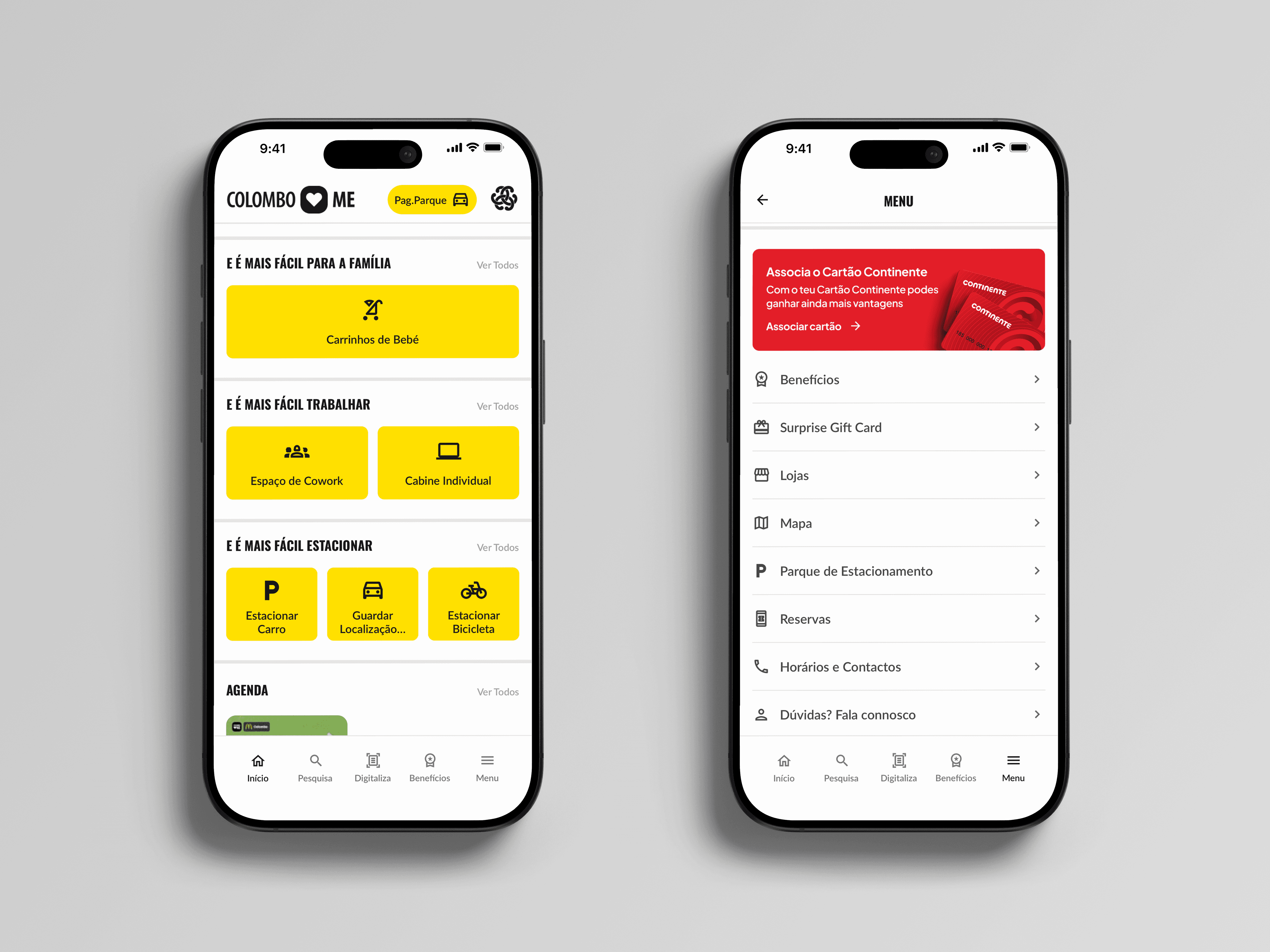
1. Organising services by task, not by category. Services such as parking, strollers, coworking and bookings were spread across the website, the app and the information desk. In my wireframes I tried three groupings that did not hold, and restructured them around what visitors wanted to do, in three tasks: Order, Book and Spaces. The trade-off: each service loses its own label, so the structure only holds if every new service fits one of the three verbs. The app Sonae Sierra launched also brings services together in one place, under Bookings.
2. One search for stores and products, with each store's state. Thematic search did not work, and the centre controlled none of its tenants' stock. I designed a single search that returns both the stores selling a brand and the matching items, each showing every store's state: Buy, Reserve, Available or Out of stock. The trade-off: a label trades precision for simplicity and cannot show each store's waiting times or conditions. Search was the highest-rated area in testing; the launched version kept stores and services only.
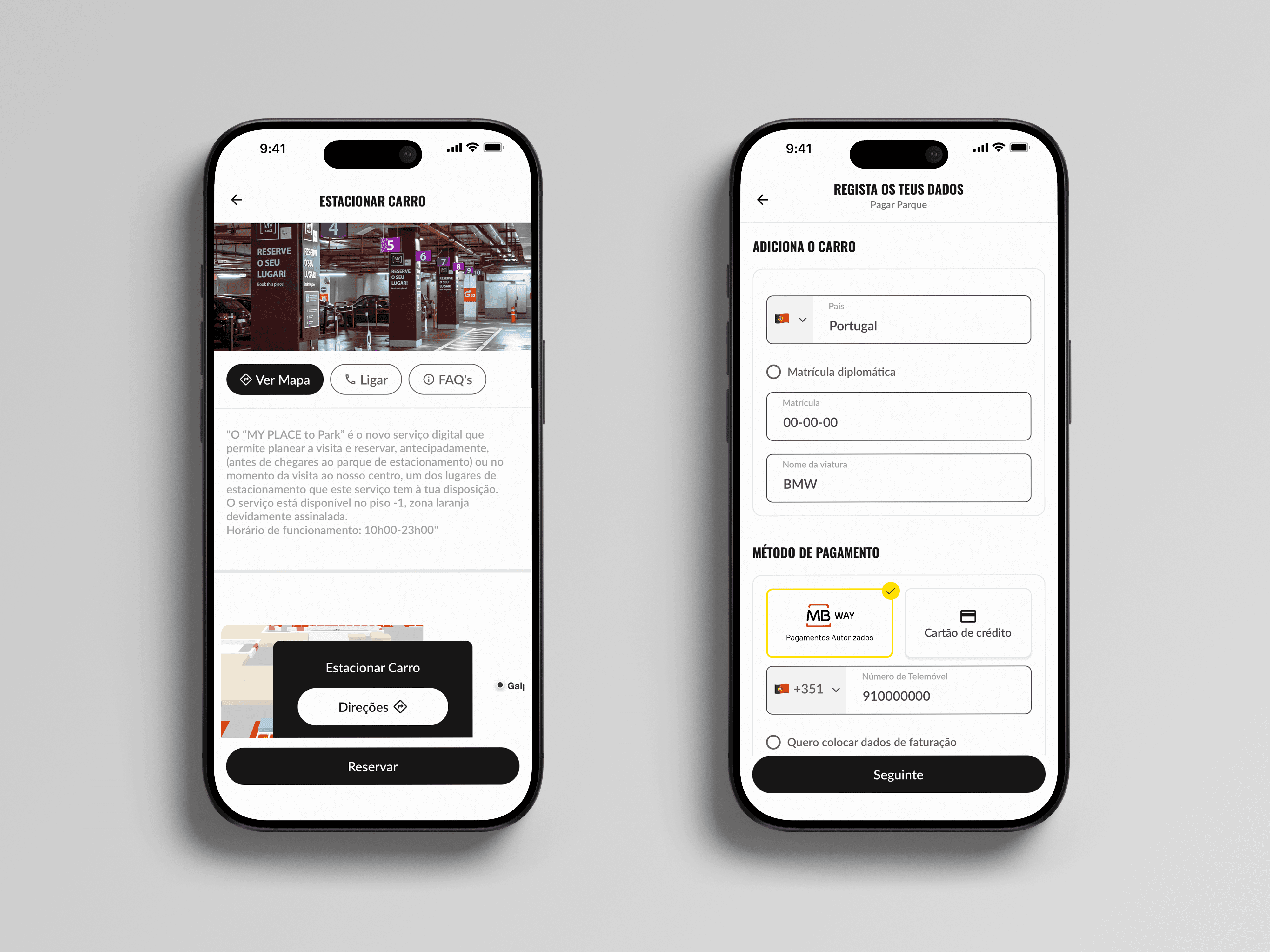
3. Designing the full cost of in-app payments. The strategy tied loyalty to an in-app wallet. I designed it end to end: identity verification, card issuance, Apple Wallet and top-ups. Seeing it whole made its real requirements clear: a licensed partner, identity checks and a long flow. The trade-off I would revisit: enrolment inside checkout took around a dozen screens and returned the shopper to the home screen. The launched app settled on MB WAY for bookings and parking.
WHAT WAS DELIVERED
A tested prototype, not the shipped app
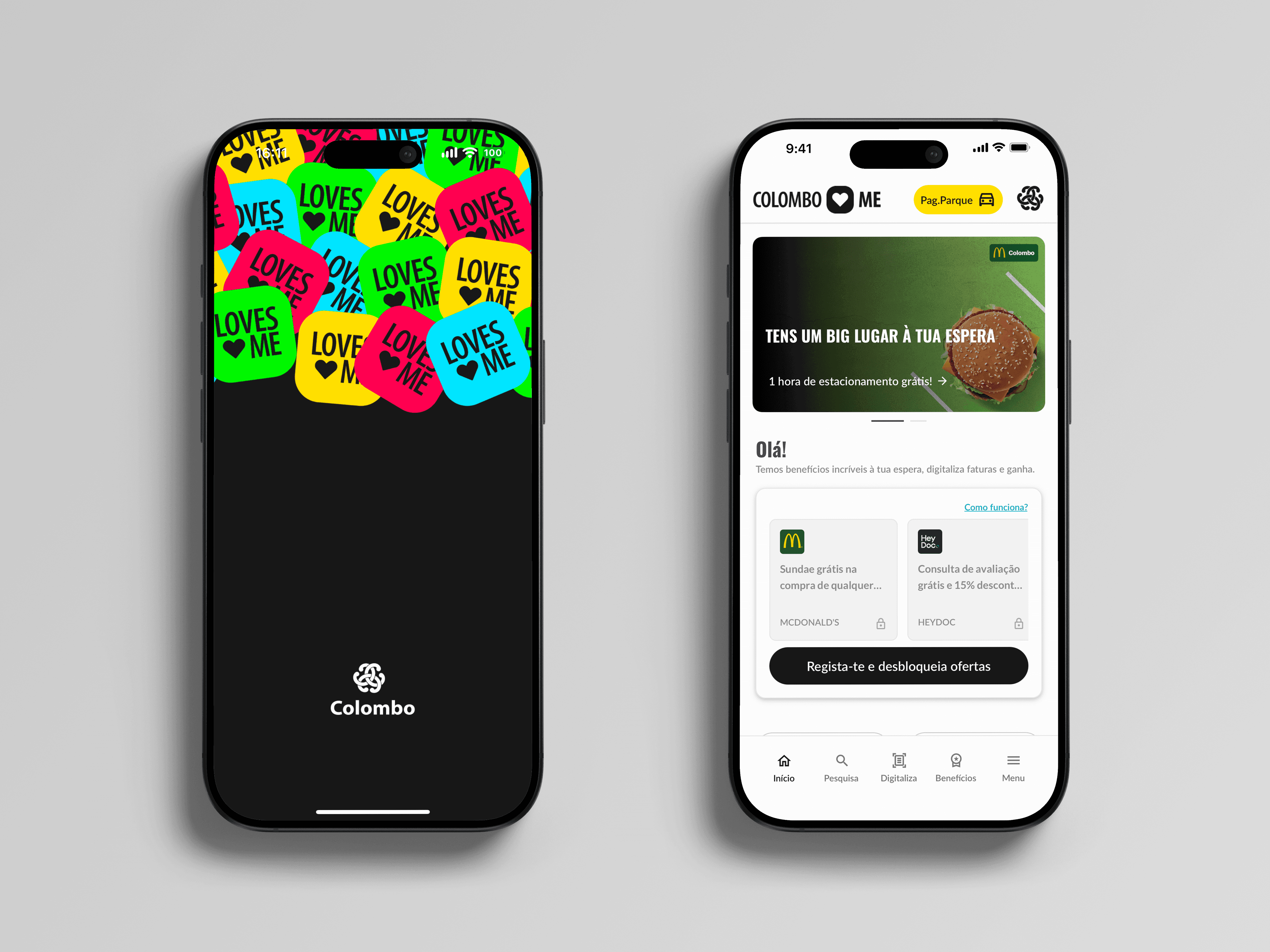
By the end of the nine months, the deliverable was a high-fidelity prototype covering fourteen flows end to end: discovering content, finding and buying across stores, paying, using the centre's services and earning rewards. It was built on a documented set of shared components (status labels, modal sheets, product cards and service shortcuts) designed to be reused across the product, not just on the screens we tested.
I was responsible for the wireframes behind the core flows and every screen of the UI. The business model came from the wider team working with the client, and the brand, motion and video came from the consultancy's own motion and brand designer.
What I delivered stopped there. Sonae Sierra took the prototype and afterwards appointed separate partners for branding and development. The app that launched in 2024 is their build, not mine, under a different visual identity and, in places, with different decisions from the ones tested here.
OUTCOMES
What the launch kept, and what it taught me
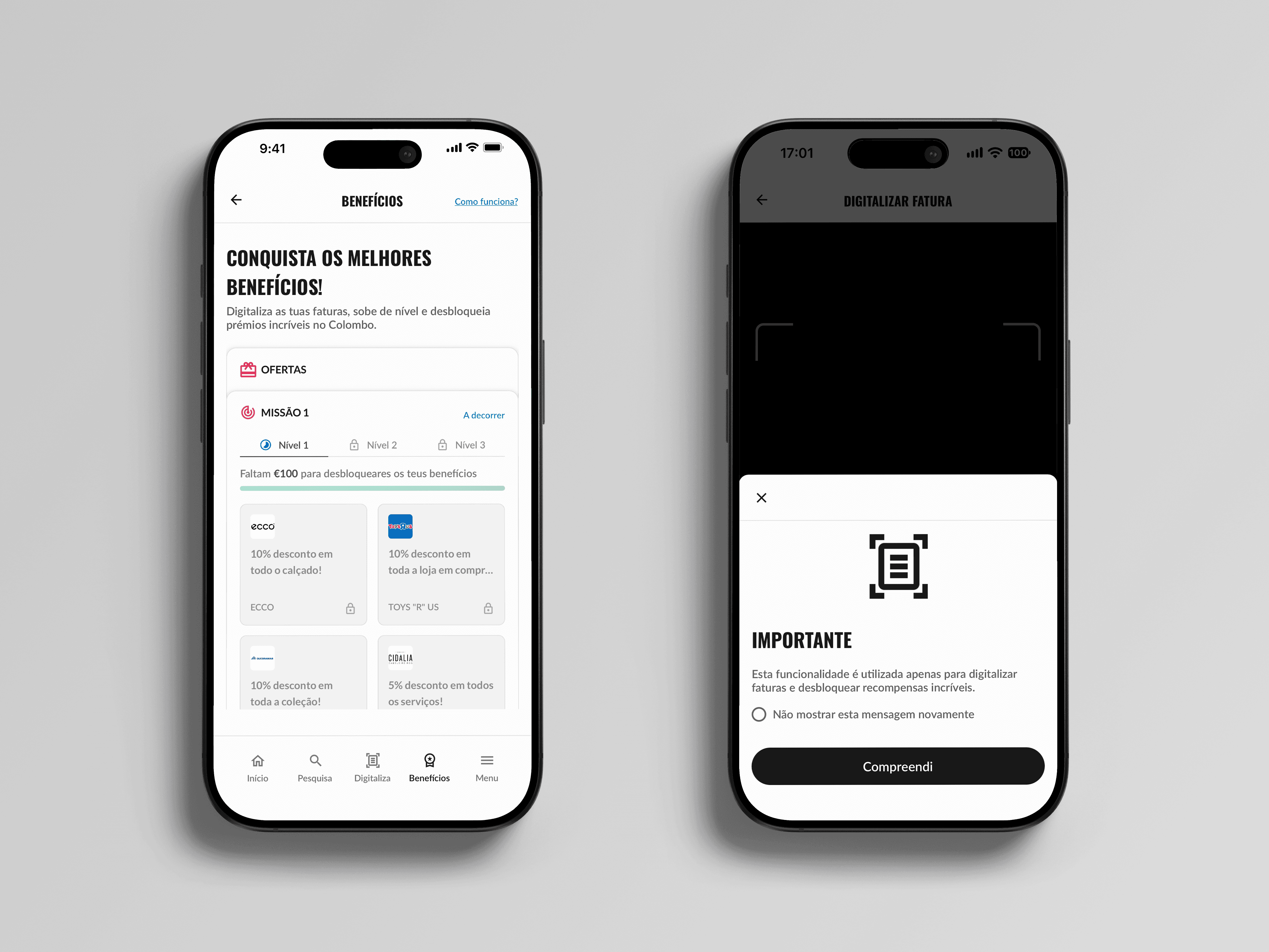
Several ideas tested in the prototype appear in the app Sonae Sierra launched: services brought together in one place, spend-based rewards with a visible progress bar and partner offers, and in-app payment for parking and bookings through MB WAY. Product search with stock per store, the in-app wallet and shoppable video did not ship. They depended on tenant stock data or a financial licence, while services already existed and belonged to the centre, which most likely made them the fastest value to launch.
The biggest lesson was about payments. We assumed loyalty needed payment data, so I designed a full wallet with identity checks and card issuance. The launched app got the purchase data it needed from the QR code on receipts, with no licence, and handled fraud through location checks and single-use codes. Next time, I would test the cheapest source of the data before designing the most expensive one. I would also make labelled navigation and accessibility a baseline from the first prototype: the launched app labelled its navigation; mine did not.