FINTECH
Credibom
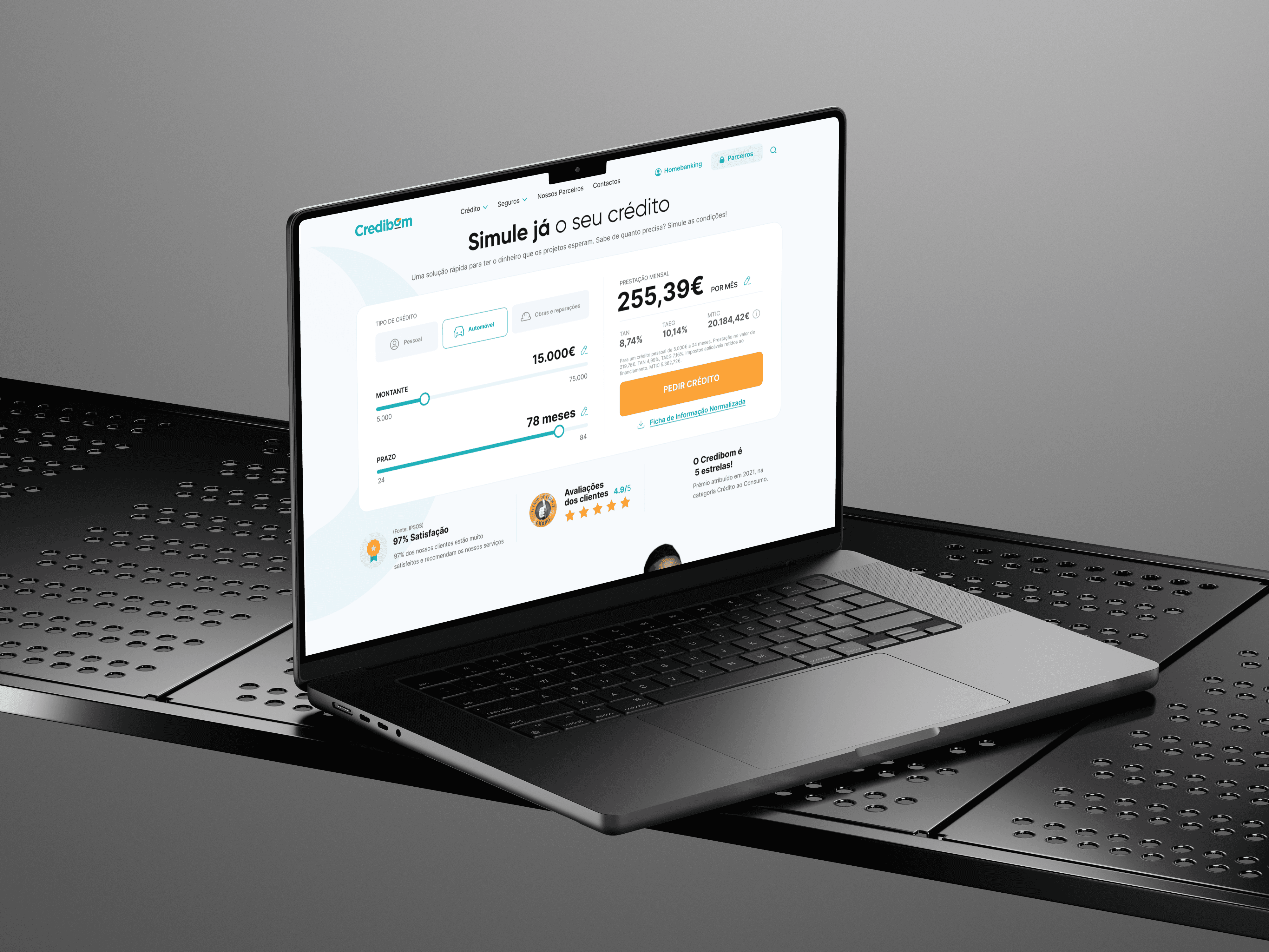
A fully digital personal loan for Banco Credibom, a consumer credit bank in the Crédit Agricole group, built to take a customer from simulation to a signed contract without paper or a branch visit, with proof of address, income and bank details retrieved through four integrated public and banking services.
Overview
A personal loan without a single piece of paper
A personal loan at Banco Credibom used to mean forms, photocopies and a 72-hour wait. The bank set out to rebuild the whole request as one digital journey, on mobile and desktop, from the first simulation to a signed contract. The ambition was a loan that could be requested, approved and signed in one sitting, by one or two holders.
The hardest part sat in the middle. To approve a loan, a bank must verify address, income and bank details, and that proof lives outside the bank: in the tax portal, in Social Security, in the customer's own bank. The product had to retrieve those documents with the customer's consent, fall back to photos and uploads when a service failed, and adapt what it asked to each profession. All of it ran across several external vendors, each with its own rules and limits.
I joined as a Product Designer when the journey was already under way, with the earlier steps designed and the design system still being built. I designed the document collection flow, working with business, risk and engineering teams, in the largest multi-team project of my career at that point. I also adjusted screens across the journey as business requirements changed, helped on the scoring and signature steps, and ran design QA on what engineering delivered until each issue was corrected. The discovery research, the earlier steps and the design system were led by others; I contributed components to the system under the guidance of its lead designer.
THE BUSINESS CONTEXT
Why Credibom needed six minutes, not 72 hours
Consumer credit is won on response time. A customer who wants to finance a purchase compares offers in minutes, and newer digital lenders had made an immediate answer the norm. For Banco Credibom, a process that still depended on paper, phone calls and days of waiting meant losing customers before a credit officer ever saw their request.
The bank could not simply remove steps. By law it must identify every customer and assess whether they can afford the loan, which requires proof of identity, address, income and bank details. The business case for the new journey was to keep every one of those checks and move the effort from the customer to the system: fewer fields, documents retrieved at the source, and a contract signed remotely. The bank set the ambition at six minutes from simulation to money.
Two outcomes mattered to the business. The first was more completed requests, because the document stage is where applicants traditionally give up. The second was a lower cost per request, because data that arrives verified does not need to be checked by hand.
RESEARCH & DISCOVERY
Three findings, three design requirements
The discovery phase was complete before I joined. An external research team had benchmarked competitor journeys, run journey workshops with credit customers, interviewed store partners who sell credit at the counter, and led a prioritisation workshop with the bank's stakeholders. I did not take part in any of it. My job was to read it closely and design from it.
Three findings shaped the document collection flow. Customers asked for less bureaucracy, and the documents were where the bureaucracy lived: finding them, copying them, sending them again when one was rejected. Customers also asked for transparency, wanting to know what was being requested and why. And both customers and partners described the same failure, a process that stopped without explanation and left them with nowhere to go.
Each finding became a design requirement for my module. Less bureaucracy meant retrieving documents at the source instead of asking for uploads. Transparency meant showing, before any consent, exactly which documents each service would hand over. And no dead ends meant that every failed connection had a second attempt, a manual alternative and a route to a person.
KEY DECISIONS
Automating document collection without losing trust
1. Framing the choice by time, not by technology.
Customers choose between two ways of providing documents: connecting to Autenticação.gov, the tax portal, Social Security and their own bank, or photographing each document. I labelled the options by what they cost the customer, an estimated three minutes or fifteen, instead of by how they work. The trade-off is that a time on screen becomes a promise the product has to keep.
2. Asking for consent one service at a time.
Each service shows which documents it will hand over, and the customer selects only the ones they are comfortable with. A single "connect everything" button would have been faster to design and to use. I chose control over speed, and accepted that mixing automatic and manual collection multiplied the number of states to design. The gap I would close today: the flow explains what is collected, not why it is safe to enter tax-portal credentials inside a bank's journey.
3. Asking only for what applies.
A generic checklist would ask a self-employed customer for payslips they do not have, or a homeowner for a landlord's IBAN they do not need. I conditioned every document request on profession and housing situation, so each customer only sees what applies to them. The trade-off: keeping every branch consistent across that many combinations took most of my design QA time on this module.
4. Never losing progress when a service fails.
A failed connection gets a second attempt, then moves that document to the manual path while keeping everything already collected, so nothing is ever asked twice. The cost was scale: the module grew to more than a hundred screens and states, most of them for situations a customer rarely sees.
WHAT WAS DELIVERED
Every path, every failure
I delivered the complete document collection flow in high fidelity, ready for engineering: more than a hundred screens and states covering both ways of providing documents. The automatic path connects to four services, Autenticação.gov (the government's digital authentication service), the tax portal, Social Security and the customer's own bank, each with its own consent, loading, confirmation and failure screens. The manual path covers photo capture and file upload for every document, with a legibility check after each photo.
The flow adapts to the customer. Employees, pensioners and the self-employed are each asked for a different set of income documents, and employees can choose between two alternative sets. Every screen was delivered with its business rules annotated on the flow map, so that engineering and the vendors could read the logic alongside the interface.
Beyond my own module, I delivered screen changes across the journey as business requirements evolved, supported the design of the scoring and signature steps, and contributed components to the design system under the guidance of its lead designer. The last deliverable was less visible: repeated rounds of design QA on what engineering built, comparing it against the design and working with developers until each difference was resolved.
OUTCOMES
From paperwork to four connections
On the automatic path, five types of supporting document are retrieved at the source, with consent, instead of being found, copied and uploaded by the customer: proof of address, proof of IBAN, proof of income, the annual tax statement and bank statements. A step that depended on the customer's paperwork became one that depends on four connections, each with a designed fallback. The bank, in turn, receives data already verified by the entity that issued it, which takes manual checking out of that path.
I left the project before the product reached customers, so I have no conversion or completion figures to report, and I will not estimate them. If I could measure this module today, three questions would matter most: whether the request for tax and banking credentials inside the flow is where customers abandon it; whether the three-minute and fifteen-minute estimates hold up as real completion times; and whether customers over 55, the bank's largest customer group, can get through photo capture and authentication unaided.
One thing I would do differently: I would treat the manual path as a first-class journey, not a fallback. It is where the effort returns to the customer, and it is the likeliest point of abandonment in the flow.

