TICKETING
MEO Blueticket
One of Portugal's largest ticketing platforms, redesigned for app and web to handle festivals, museums and seated shows in one system, with split payments, instalments and self-service resale built in.

Overview
Self-service after purchase, at 9 million tickets a year
MEO Blueticket is one of Portugal's main ticketing operators, selling more than 9 million tickets a year for around 950 events, from music to sport. Its website receives more than 10 million visits a year. Owned by Altice Portugal and Arena Atlântico, it sells through its website, its app and more than 3,500 points of sale. Until the redesign, anything after the purchase, from a lost ticket to a cancellation, meant a phone call or an email.
I joined after the strategy phase and worked alongside the resident research and UX team through discovery, user testing and specification. I designed the UI and user flows of the new app and website, including the UI kit they are built on. The scope covered discovery and search, registration, three checkout models, split and instalment payments, and a ticket that can be shared, resold or upgraded after purchase.
I supported engineering through handoff. The new website launched in October 2024 and the app in July 2025. At launch, the press highlighted sharing, upgrade, resale, split payments and the new seat selection as headline features, each of them part of the flows I designed.
THE BUSINESS CONTEXT
An app customers wanted, but did not use
MEO Blueticket is more than a storefront. Spun off from the ticketing division of Arena Atlântico, the company runs the full ticketing operation for promoters and venues: event and venue configuration, sales, access control and real-time financial reporting. Its stated strategy is to compete on convenience, security and the breadth of its digital and mobile offering, in a market where it already ranks among the country's main ticketing operators.
The consumer experience lagged behind that ambition. Discovery research found that only 14.4% of customers used the existing app, although 55% wanted to. MB WAY, the payment method most customers in the research preferred, did not work in it. Service fees were a recurring source of distrust. And anything after the purchase, from a lost ticket to a cancellation, required a phone call, an email or a trip to a box office: a cost the business absorbed manually, one ticket at a time.
Behind the interface, the new product also had to work with fragmented back-office systems, white-label and partner sites, and event rules set individually by each promoter. The brief was not a new look. It was a single self-service system that could sell every type of event and keep customers in the app long after the purchase.

RESEARCH & DISCOVERY
Mapping where the experience broke
Discovery ran in two rounds. In the first, the team interviewed 41 people, 25 customers and 16 business partners such as promoters and venues, and surveyed 306 customers. The full service was then mapped across seven sales channels, from the app and website to partner sites, kiosks and venue box offices, and five stages, from choosing an event to getting through the door. In the second, the redesigned prototype was tested with 46 customers and partners across nine locations. I took part in both rounds alongside the resident research team, and my responsibility was turning the findings into flows.
The first finding was that the purchase broke at the critical moments. An account created in the app could not be used to buy, and MB WAY, the method most customers preferred, did not work. I designed registration to appear only when it was needed, at the moment of buying or saving a favourite, and I designed a native MB WAY flow with the phone number already filled in.
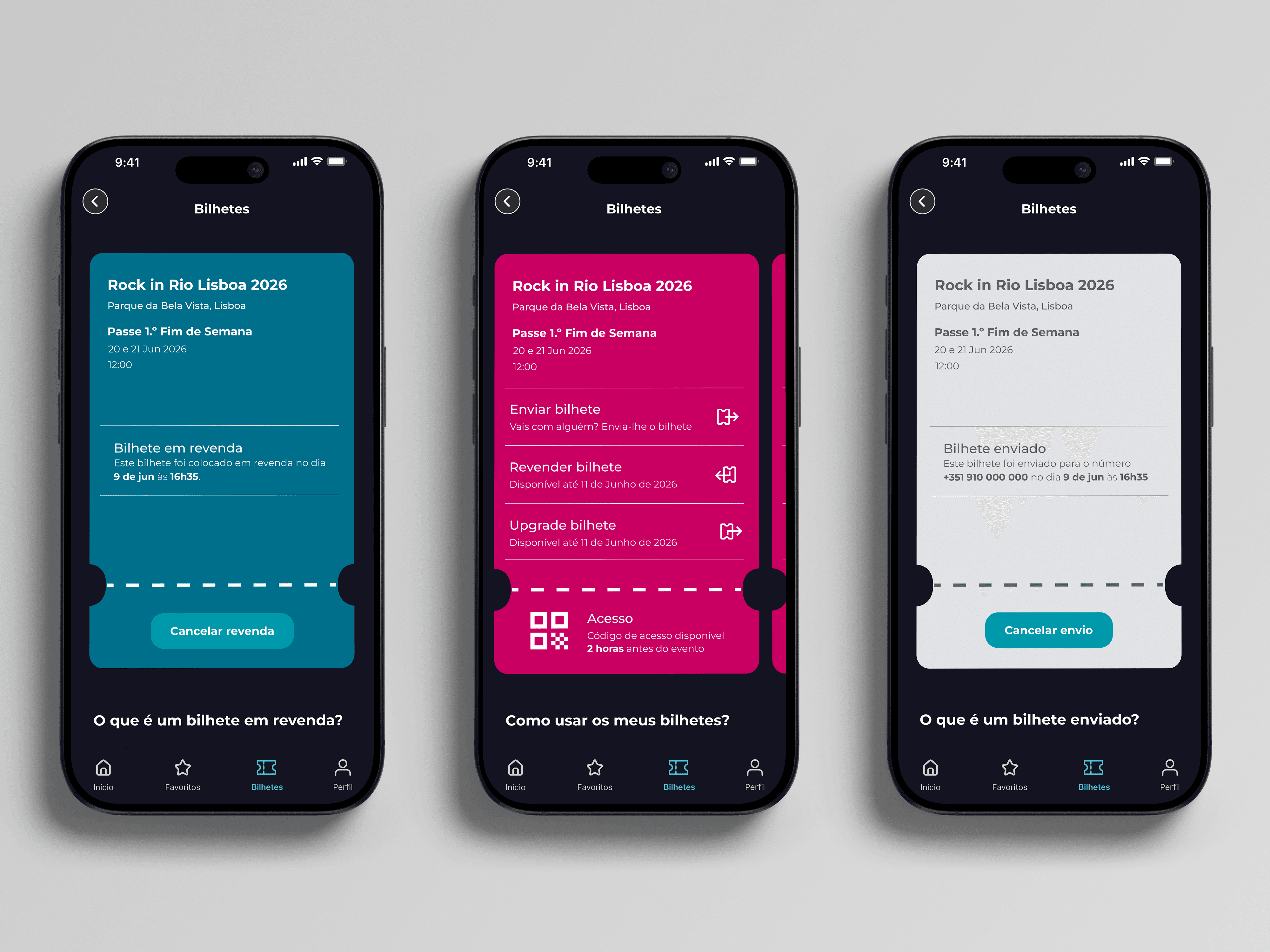
The second finding was that there was no self-service after the purchase. Every change went through a phone line, an email or a box office. In response, I designed a ticket that lives in the app and can be sent to a friend, resold at its original price or upgraded by paying only the difference.
The third finding was behavioural: groups buy together. One person usually buys for everyone and settles up with friends afterwards. This led to two features, a "split the bill" option at checkout and the ability to send each ticket to a friend by phone number.
The fourth finding was anxiety. Customers feared the system would crash during sell-outs, distrusted fees they could not explain and worried about fake websites. I answered with a virtual queue that shows position and waiting time, a purchase timer that can be extended, fees shown before the Buy button and an official resale channel inside the app.
Testing also shaped what was left out. Features that scored poorly, such as a feed of friends' activity, did not make it into the final product.
KEY DECISIONS
Five decisions that shaped the product
1. A ticket that lives after the purchase
The ticket is a system of states: active, sent, on resale, resold, pending payment or ready for entry. It can be sent by phone number, resold at its original price or upgraded by paying only the difference. That is why a phone number, confirmed by SMS, is the account's identity: it is one step more than email alone, but it is what makes sending tickets possible. The access code appears two hours before the event, which reduces fraud but means customers cannot see it in advance.
2. One checkout for every event
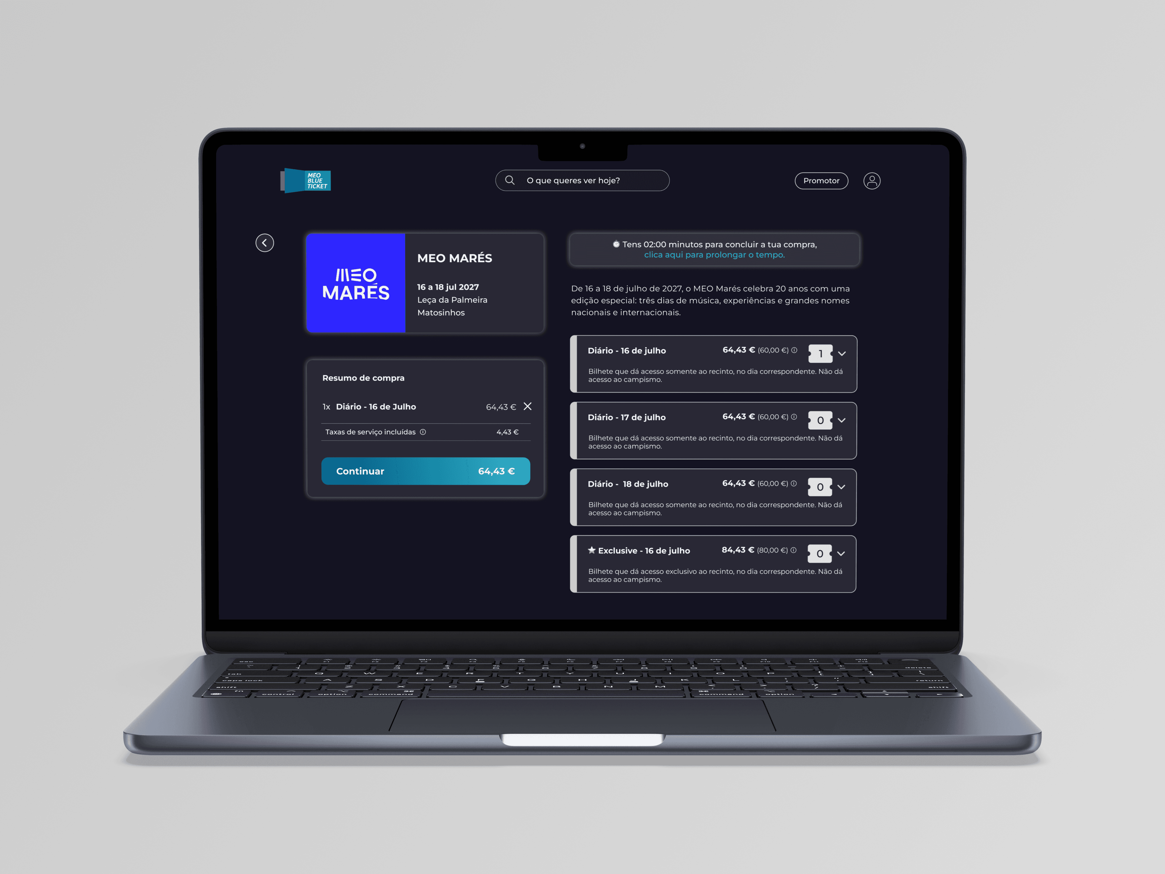
Festivals, museums and seated shows share a single checkout that changes only at the selection step: a quantity, a time slot or a seat. Customers learn to buy once, and a new promoter can launch without a new flow. The cost is a summary that carries every option on every event, so each extra is a single switch, off by default, which also keeps every paid extra opt-in.
3. A list before the map
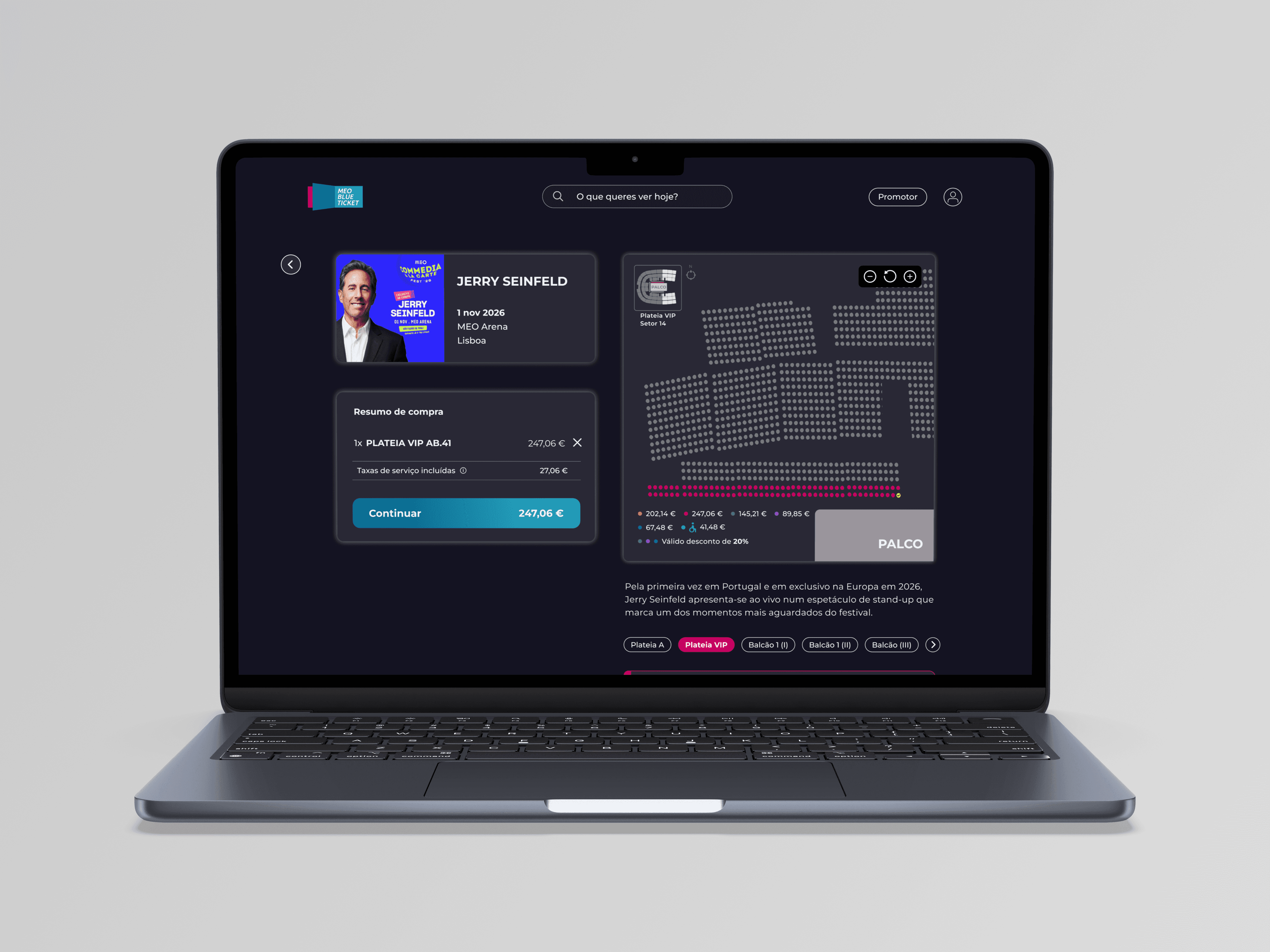
Seat selection starts from a list of sections with prices, with the interactive map and an automatic choice of the best seats as options. It is faster on a phone and works with screen readers. I traded a more spectacular first screen for a purchase that works for everyone.
4. Paying together and paying later
With "split the bill", the buyer assigns tickets to friends who pay their own share, and the summary drops to theirs. Instalments split a pass into three payments, each approved as an MB WAY request on the due date. Limiting instalments to MB WAY and PayPal was the price of no surprise debits.
5. Discovery that updates itself
Each home section follows a rule: an editorial headline, new releases by date, top sellers by actual sales, and personalised picks that exclude events already bought. Search works in any order, and empty categories disappear on their own. It asks more of the back-office team, but the product stays current without a designer in the loop.

WHAT WAS DELIVERED
Everything engineering needed to build it
I delivered the complete UI and flow design of the new app and website, from the UI kit to the handoff to engineering.
The foundation is a UI kit covering color, typography, spacing, corner radius, elevation and a responsive grid, with a component library built on top of it: event cards in several formats, status badges, form fields with every state, search, date and location pickers, navigation and the ticket component, which changes color and actions as the ticket moves from one state to the next. The same components serve both platforms; the date picker, for example, is a drawer on the phone and a popover on desktop.
On that system, I designed more than twenty end-to-end flows for iOS and Android, following the customer's journey. To discover: onboarding, the home screen, search and favorites. To buy: registration by phone, Apple or Google, event pages and three checkout models with pre-sale and a virtual queue. To pay: six payment methods, instalments and split payments. To live the event: a ticket wallet with sending, resale and upgrade, a dedicated flow for accessible seating, the profile and the notification center.
The website applies the same system to desktop, with its own decisions where the larger screen called for them, such as a two-panel checkout that keeps the summary fixed beside the seat map.
Every flow was documented for engineering. Screens carry the business rules behind them, the full journey is mapped as a single happy path, a catalog of error screens covers registration and login, and every iteration is logged on the files, so the team could always see what had changed and why

OUTCOMES
What reached customers
The new website and app both launched, carrying the system and flows I designed into a platform that sells more than 9 million tickets a year and receives more than 10 million website visits.
At launch, MEO Blueticket presented the app as a way to transform how customers buy, manage and use their tickets. The features the press singled out were ticket sharing, upgrades, resale, "split the bill" and the new seat selection on the app, and the full seat map, the customer area with real-time notifications and recommendations based on customer preferences on the website. Each of them came from the flows I designed.
The most important change was operational. Sending a ticket to a friend, reselling it or upgrading it had previously depended on a phone line, an email or a trip to a box office. In the new product, each of these is a self-service action inside the app, confirmed in seconds.
I left the project at handoff, before launch, so I do not have access to post-launch data. If I were measuring this product today, I would track four numbers against the discovery baseline: the share of customers buying through the app, payment success by method, checkout completion, and the volume of support contacts by reason. Those are the numbers that would show whether self-service replaced the phone call.